One of the reasons I love to work with Qlik is that it seemingly restrains me to design visualizations as I would like to. But, in reality, it just pushes me to think outside of available settings and sharpens my developer mindset => all is possible if you use the right functions. The things one can do with chart expressions are just amazing (check the newest blog by Patric Nordstrom on visualization tips).
My Challenge
I need to create a chart, which will be colored by my custom color set for the dimension, but since it has 2 measures, these also need to be distinguished. Let’s look at it directly.
Chart with custom dimension color
I have this bar chart and the coloring of dimension values is important because I want to keep the colors persistent in the whole app.

Now, I would like to add another measure to have more context. I end up with this…

… not good. Yes, the coloring is maintained but I cannot distinguish the measures. I could switch to coloring by measures, but then I lose my custom dimension colors, like this:

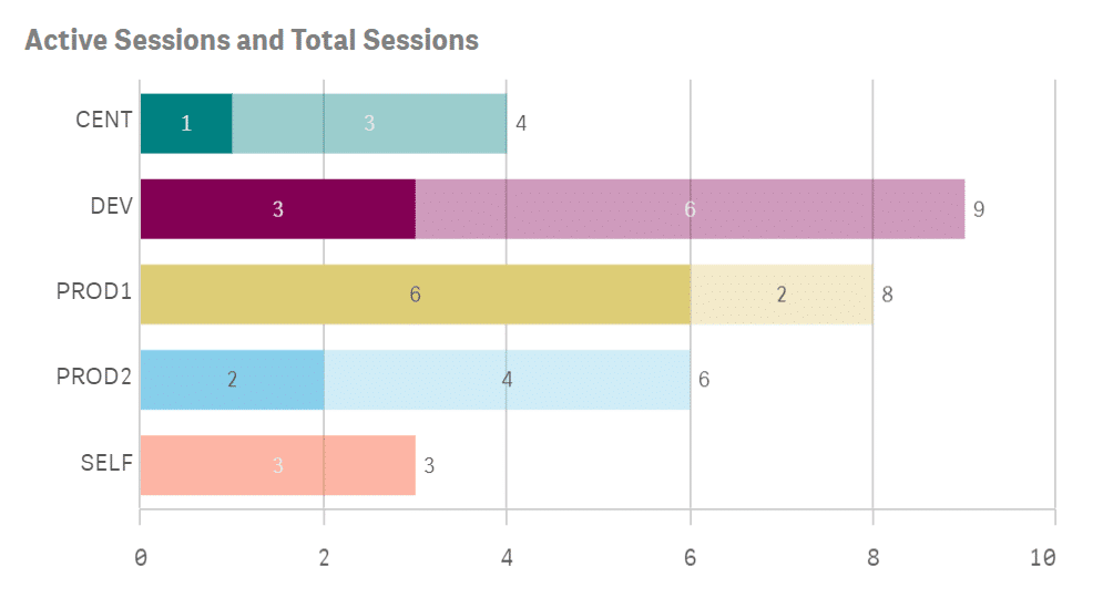
Enter ValueList() and BitAnd functions
The result looks like this:

The steps to achieve it are:
1. start with a regular chart with one dimension and one measure
2. add a second dimension, calculated with ValueList() function, e.g.:
=valuelist( ‚Active‘, ‚Total‘ )
3. adjust the expression to condition the calculation on the same ValueList() function, e.g.:
=pick( match( valuelist( ‚Active‘, ‚Total‘ ), ‚Active‘, ‚Total‘ ), < expr 1 >, < expr 2 > )
4. change the color setting
- First, pick the color for each value of the main dimension, e.g. =pick( match( <field>, $(=concat( {1} DISTINCT chr(39) & <field> & chr(39), ‚,‘ )) ), $(c_Teal), $(c_Purple), $(c_Yellow), $(c_SkyBlue), $(c_Red), $(c_Green), $(c_Blue) )
- Second, multiply that first expression by another, that will add transparency to the second measure, e.g. * bitand ARGB( pick( match( valuelist( ‚Active‘, ‚Total‘ ), ‚Active‘, ‚Total‘ ), 255, 100 ) ,255,255,255)
I used this technique in my Qlik Engine Health-check app for monitoring the availability and performance of the Qlik environment, but I believe it can come in handy when designing any business dashboard.
Read my other blogs HERE.


