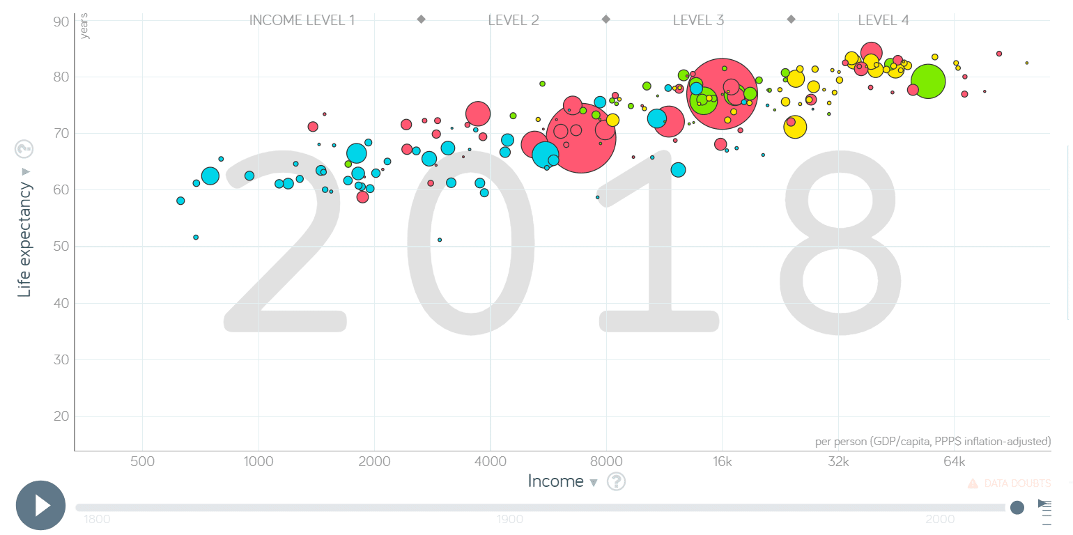
Have you heard about Gapminder’s animated bubble chart? If not, I recommend you to have a look at this webpage to learn about Gapminder’s noble goal to fight devastating misconceptions about global development. The animated scatter plot is displaying the change in life expectancy and income through time from 1800 to 2018 where bubbles are coloured by 4 world regions (The Americas, Europe, Asia and Africa) and bubble size represents the population. Let me tell you: the world has improved a lot! Roll up your sleeves and let’s make that one using Qlik Sense. You will only need what comes with the standard installation (make sure you have checked the box during installation to install the Dashboard bunde – the variable input is needed).
Get the data
First we have to download all the data needed (free data from www.gapminder.org/data)
- Population data: https://github.com/Gapminder-Indicators/pop Download pop-by-gapminder.xlsx
- Life expectancy data: https://github.com/Gapminder-Indicators/lex Download lex-by-gapminder.xlsx
- Income data: https://github.com/Gapminder-Indicators/gdppc_cppp Download gdppc_cppp-by-gapminder.xlsx
- Regions data: http://gapm.io/dl_geo will download Data Geographies – v1 – by Gapminder.xlsx
Load data into Qlik Sense
Load data into Qlik Sense so that there are 2 tables in the data model. One is called Data and contains fields geo, Year, Population, LifeExpectancy and Income and the second is called Countries and contains fields geo, Country and Region.
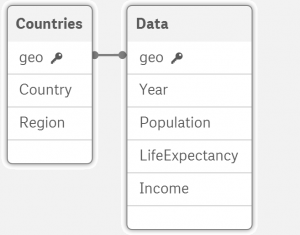
Feel free to use the script at the end of this post, but do not forget to set the connection GapminderData to the folder where you saved the 4 xlsx files. To get the data in correct form Crosstable method is applied.
Build the animated scatter plot
- Go to Custom objects > Qlik Dashboard bundle > Variable input. Change it to slider and assign vYear variable to this visualisation. If you do not have such variable, create it either in script or use front-end variable editor. Set Min to 1800 and Max to 2018. Step should be set to 1.
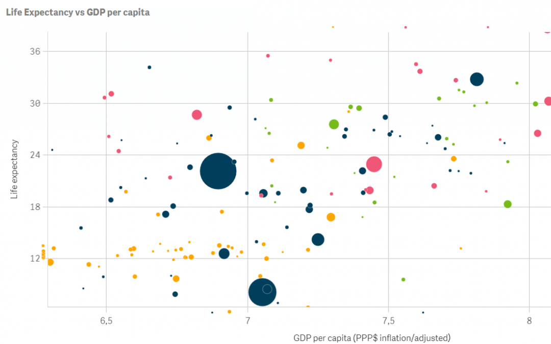
- Create scatter plot and set:
Dimensions > Bubble:=Country
Measures > X-axis:=Dual(Avg({$<Year = {$(vYear)}>}Income), log(Avg({$<Year = {$(vYear)}>}Income)))
We are using dual function, because X-axis is transformed using natural logarithm, but on hover on a single bubble we still want to show the actual income values. Do not forget to change Number formatting to Measure expression.
Measures > Y-axis:=Avg({$<Year = {$(vYear)}>}LifeExpectancy)
Measures > Size:=Dual(Num(Avg({$<Year = {$(vYear)}>}Population)), Avg({$<Year = {$(vYear)}>}Population) / Max(TOTAL Population))
We are using dual function, because we need to scale the population using the total maximum (we want to observe how countries grew in time) but when one hovers on a single bubble we still want to show the actual population values. Do not forget to change Number formatting to Measure expression. - Set colours by regions, titles, footnote and you are ready to explore. Navigate through time by dragging the slider or use arrows on your keyboard to move year by year.
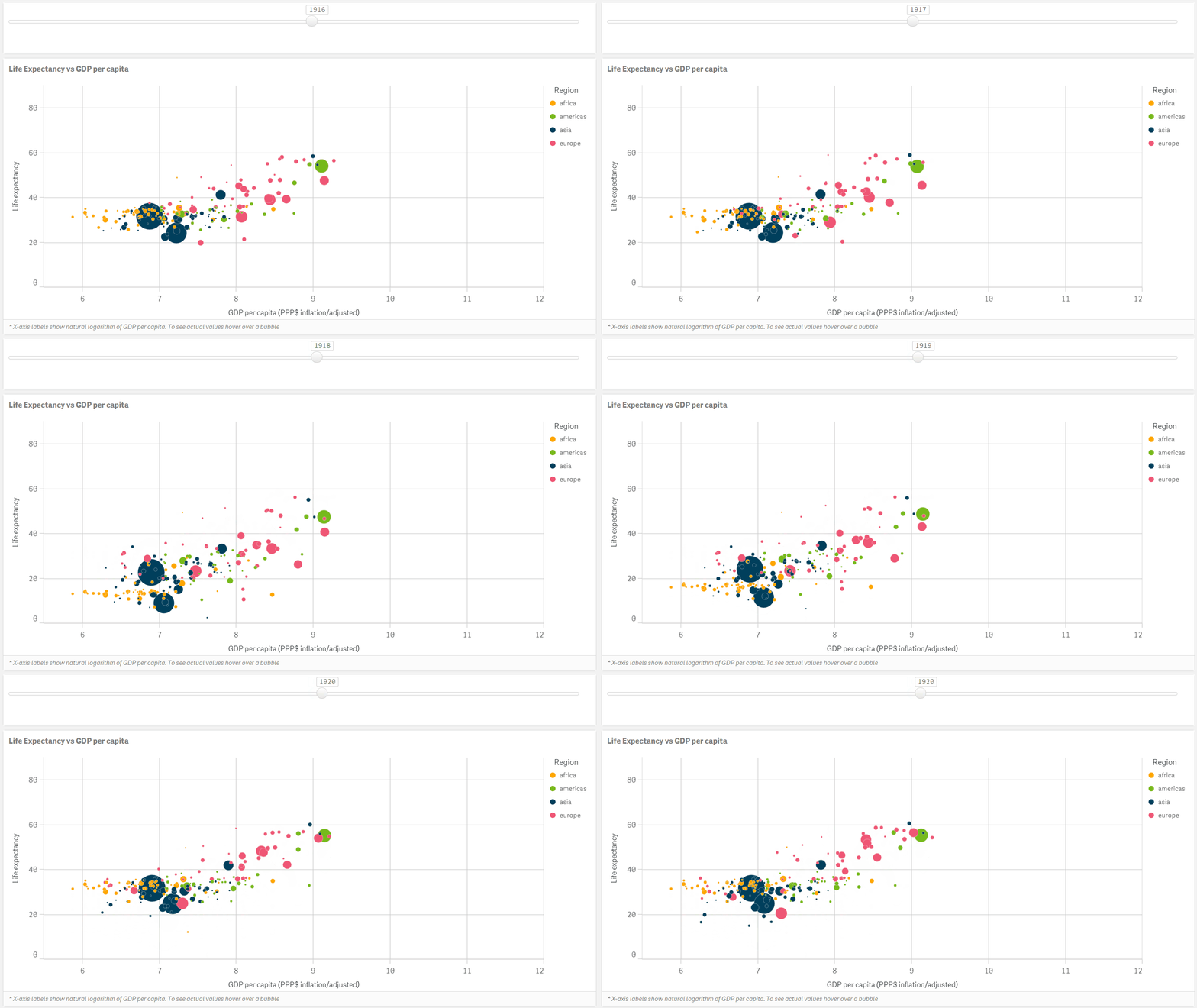
Notice how life expectancy dropped globally in 1918. The reason was the influenza pandemic with high mortality in young healthy people also known as Spanish flu which killed more people than World War I. Did you find any other interesting development in the graph that can be explained by historical events? You can apply this approach in many other use-cases. Let us know about your thoughts and suggestions in the comments. For more articles click here.
Qlik Sense script to load data into 2 tables model to create animated scatter plot
Let vYear = 2018;
Data:
CROSSTABLE (Year, Population, 4) LOAD
    *
FROM [lib://GapminderData/pop-by-gapminder.xlsx]
(ooxml, embedded labels, table is countries_and_territories);
Fact_LifeExpectancy:
CROSSTABLE (Year, LifeExpectancy, 4) LOAD
    *
FROM [lib://GapminderData/lex-by-gapminder.xlsx]
(ooxml, embedded labels, table is countries_and_territories);
Fact_Income:
CROSSTABLE (Year, Income, 4) LOAD
    *
FROM [lib://GapminderData/gdppc_cppp-by-gapminder.xlsx]
(ooxml, embedded labels, table is countries_and_territories);

Drop Fields geo.name, indicator.name, indicator;

LEFT JOIN (Data) LOAD
    *
RESIDENT Fact_LifeExpectancy;

LEFT JOIN (Data) LOAD
    *
RESIDENT Fact_Income;

Drop Tables Fact_LifeExpectancy, Fact_Income;

Countries:
LOAD
    geo,
    name as Country,
    four_regions as Region
FROM [lib://GapminderData/Data Geographies - v1 - by Gapminder.xlsx]
(ooxml, embedded labels, table is [list-of-countries-etc]);

