


Correlation does not imply causation – you probably heard that one before. However, before you decide if the causation is or is not the case, you should know the true correlation and ideally know if the correlation is statistically significant. Do not get me wrong: statistically significant correlation does not imply causation either, but at least you know that the strong positive or negative correlation is not just due to chance. Today we will learn how we can calculate correlation values together their P-values. We will visualise only the significant ones using a correlation matrix in Qlik Sense integrated with R.
What is correlation
Correlation is a number between -1 and 1 which tells you how strong is the linear relationship between two variables. Values close to -1 mean that there is negative linear relationship between the two variables. Values close to 1 mean there is strong positive relationship between the two variables. If the correlation coefficient lays near to the 0, there is no linear relationship between the 2 variables. There are many cases when the correlation coefficient is close to 0 but there is strong dependency between the two variables, just not linear (for example quadratic relationship can be overlooked by correlation coefficient). Commonly used correlation coefficient is called Pearson’s correlation coefficient.
Load data into Qlik Sense
Download data from here. The data-set contains data from 1985 Ward’s Automotive Yearbook. First, we should rename the columns using aliases in Qlik Sense, since R does not like ‘-‘ in column names and it would replace them by ‘.’ which would create an unnecessary mess.
Load the data
CarData:
LOAD
RowNo()                                   as "car_ID",
symboling,
"normalized-losses"                       as "normalizedlosses",
make,
"fuel-type"                               as "fueltype",
aspiration,
"num-of-doors"                            as "numofdoors",
"body-style"                              as "bodystyle",
"drive-wheels"                            as "drivewheels",
"engine-location"                         as "enginelocation",
"wheel-base"                              as "wheelbase",
"length",
width,
height,
"curb-weight"                             as "curbweight",
"engine-type"                             as "enginetype",
"num-of-cylinders"                        as "numofcylinders",
"engine-size"                             as "enginesize",
"fuel-system"                             as fuelsystem,
bore,
stroke,
"compression-ratio"                       as "compressionratio",
horsepower,
"peak-rpm"                                as "peakrpm",
"city-mpg"                                as "citympg",
"highway-mpg"                             as "highwaympg",
price
FROM [lib://Data/Correlation matrix/Automobile_data.csv]
(txt, codepage is 28591, embedded labels, delimiter is ';', msq);
Run the R script
Now, we have to calculate correlations and corresponding P-Values using R. Do not hesitate to use the following script.
Tmp_Correlation:
Load * Extension R.ScriptEval( '# install.packages(Hmisc, repos="http://cran.us.r-project.org"); //keep # if you have this package already installed
library(Hmisc);
df <- as.data.frame.list(q, strings.as.factors = FALSE);
df <- Filter(is.numeric, df);
cor <- as.data.frame.list(rcorr(as.matrix(df), type="pearson"));
cor$varname <- rownames(cor);
cor;',
CarData{wheelbase,length,width,height,curbweight,enginesize,bore,stroke,compressionratio,horsepower,peakrpm,citympg,highwaympg,price});
Transform the R script result
The R-script returns a compact table containing everything. I prefer to clean it up a little so that we end-up with a nice data model.
Tmp_Correlation_Crosstable:
CROSSTABLE (Variable2, Value) LOAD
varname as Variable1,
*
RESIDENT Tmp_Correlation
;

Tab_Correlation:
LOAD
*,
Variable1&'|'&Variable2 as %KeyCor;
LOAD
Variable1,
Replace(Variable2, 'r.', '') as Variable2,
Value as Correlation
RESIDENT Tmp_Correlation_Crosstable
Where Variable2 like 'r.*';

Tab_PValues:
LOAD
[P-Value],
Variable1&'|'&Variable2 as %KeyCor;
LOAD
Variable1,
Replace(Variable2, 'P.', '') as Variable2,
Value as [P-Value]
RESIDENT Tmp_Correlation_Crosstable
Where Variable2 like 'P.*';

Drop Tables Tmp_Correlation, Tmp_Correlation_Crosstable;
You should end up with a 2-table data model like this:

Create correlation matrix in Qlik Sense
Good job! We are ready to set-up a visualisation on top of the data model we have. As the result we will have a correlation matrix showing actual Pearson’s correlation coefficient values together with colours (dark blue for negative correlations and red for positive ones). In addition to that we will also have a slider to select P-Value levels which will be shown. With this approach you can show and analyse only statistically significant correlations and also select any significance level.
Create correlation matrix using the heatmap chart
Select Heatmap chart from Qlik Visualization bundle and set:
- Data > Dimensions: set 2 dimensions Variable1 and Variable2
- Create new variable vSign and leave the Definition empty
- Data > Measures:
=Avg({<[P-Value] = {"<=$(vSign)"}>} Correlation)
; set label to Pearson’s correlation coefficient - Appearance > Options: Do not use mean in scale and use fixed scale instead. Set Min Scale Value to -1; Max Scale Value to 1 and Minimum Horizontal Size to 0
- Appearance > Design: Select the Qlik Sense Diverging colour schema
- Appearance > General: set the title to Correlation matrix
Make the heatmap responsive to the significance level
The heatmap is all set but we still have to add some kind of input to assign values to the vSign variable. Let’s use slider for that.
Go to Custom objects > Qlik Dashboard bundle > Variable input. Change it to slider and assign vSign variable to this visualisation. Set Min to 0.01 and Max to 1. Step should be set to 0.01. All done, you have fully interactive correlation matrix with an option to select statistical significance level. Move the slider and observe how non-significant correlations disappear.
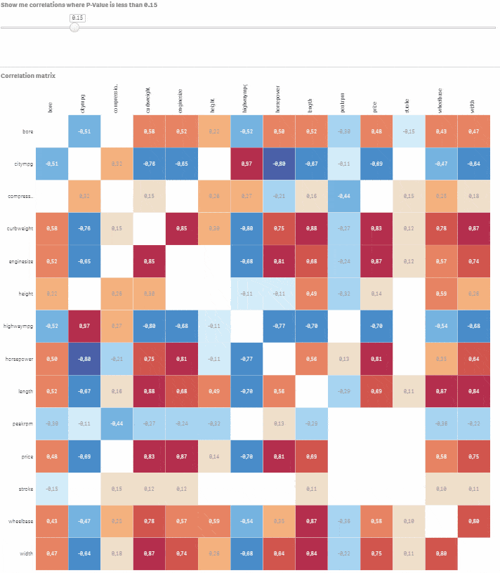
Interactive correlation matrix
Let’s say you would like to model car price based on the other numeric variables. Click on the corresponding row and navigate using the slider to select correlations where P-Value is less than or equal to 0.05. You now have a good starting point for building your model using price as dependent variable and bore, citympg, curbweight, enginesize, highwaympg, length, wheelbase, width as explanatory variables.

If you are interested go ahead and check the last article from the Creative visualisations in Qlik Sense series about the Q-Q plot.


Trackbacks/Pingbacks