


Is your data normally distributed? In a lot of cases we don’t care, but if you you are using some of the well-known statistical methods, the answer better be ‘Yes’ or at least ‘No, but I am aware of that and I know what to do about it’. Because normality of the data is quite a topic, it is convenient to have a handful of approaches to evaluate if the condition is met.
How do you evaluate normality of the data in Qlik Sense? Maybe you write your own normality tests. Do you consider also sample sizes and the statistical power of such tests? Or do you use look-and-see approach when you look at the histogram and simply decide if the data is ‘normal enough’ or at least symmetrical? Today, I will show you another (and in my option quite elegant) way anyone can use to evaluate normality of the data using Q-Q plot (quantile-quantile plot). The Q-Q plot is not exclusive method for normally distributed data only. If calculated correctly, you can evaluate other statistical distributions too.
How normal Q-Q plot works
Normally distributed data follow the bell shape or Gaussian curve. The visual check for normality can be done using the histogram when you compare its shape with the theoretical shape. There are also more sophisticated statistical tests but those are currently not available in Qlik Sense (unless you write them by yourself).

Bell curve
How the Q-Q plot works? First, we calculate theoretical and actual quantiles. Then, we plot them against each other. If the theoretical and real distribution match, data-points will follow a line. If you observe strange S or U-shapes or the data points are far from the theoretical line those data are most likely not normally distributed.
In the following example we generated 10 000 samples from the standard normal distribution (mean = 0, standard deviation = 1). See the picture below. Histogram follows the bell shape and the blue points in Q-Q plot are linear and lay on the red line. Therefore, we can assume that the data follow normal distribution (and in this case we know those are generated from normal distribution).

Normally distributed data (histogram and Q-Q plot)
Can you guess the truth using histogram only?
Before I show you how the Q-Q plot is done let’s play a game. Look at the 4 histograms below and guess if the data follow normal distribution.

It is not always easy to evaluate normality of the data using histogram only. Moreover, those 4 examples are well behaved data we generated from various distributions. Can you imagine the mess we see when we use the real-life data? Now look at the Q-Q plots corresponding to the histograms above.

Have you changed your guesses? How closely do the blue points follow the red line? Personally, I can see the deviations from the normal distribution clearer in the Q-Q plots. The actual distributions from left to right are:
- Normal distribution: mean = 0, standard deviation = 1
- Poisson distribution: lambda = 10
- Weibull distribution: shape = 4, scale = 1
- Log-normal distribution: mean = 0, standard deviation = 0.5
Evaluate your guesses. Have you revealed all 3 non-normal distributions? Yes? Maybe you even guessed the names and parameters of all distributions just by a glance. In that case you do have pretty great and potentially dangerous supernatural powers!
Q-Q plot in Qlik Sense
Let me show you how you make the Q-Q plot in Qlik Sense. First of all, let’s generate some random data in the data load editor:
    NormalData:
    LOAD
        RowNo() as _Id,
        NormInv(Rand(), 0, 1) as Data
    AutoGenerate 100;
Here is a step-by-step guide to create your own Q-Q plot:
- Create combo chart and set:
Dimensions > Bar and line:=NormInv((Aggr(Rank(-[Data],4), _Id)-0.5)/Count(TOTAL [Data]), 0, 1); set label to='Theoretical quantiles'
Measures > Height of bar:=Data; set label to='Sample quantiles'; change the shape from Bars to Marker
Measures > Height of line:=StDev(TOTAL [Data])*NormInv((Aggr(Rank(-[Data],4), _Id)-0.5)/Count(TOTAL [Data]), 0, 1) + Avg(TOTAL [Data]); set label to=chr(160); make sure the line is displayed on primary axis - Appearance > Colors and legend: hide legend
- Appearance > X-axis: set the axis to continuous and hide the mini chart
- Appearance > General: set the title to Q-Q plot
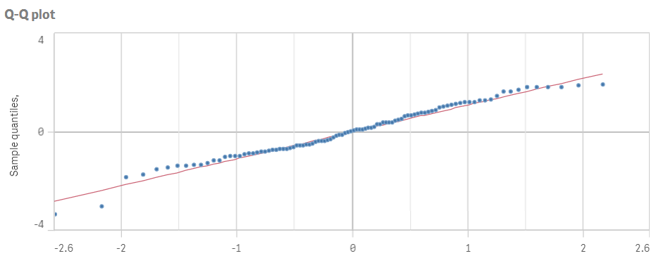
There you go. You just created your own Q-Q plot using nothing else but Qlik Sense. Re-use this approach on any data or distributions. If you are feeling super determined to make your Q-Q plots perfect, calculate and add confidence bands to the chart.

Q-Q plots with confidence bands
Can you see the advantages of Q-Q plot? Would you use it, or are you more comfortable with other methods to evaluate distribution of your data?
If you are interested go ahead and check the last article from the Creative visualisations in Qlik Sense series about the density plot.


Hola muchas gracias por compartir tan buena info sobre Qliksense. Seria de mucha ayuda si se pudiera descargar algun QVF con el ejemplo del tema tratado. saludos