


All objects in Qlik immediately recalculate after selection to show only the associated data in the charts… Well, I don’t know a single app that would behave only like that (if you do, let me know in the comments what is it for). All my fellow Qlik designers, I included, use this magical thing called Set Analysis basically all the time, to change that default behavior. Time comparisons, benchmarking, forecasting, various ratios, specific business rules, and… data brushing, all these are nicely done with the help of Sets.
Data brushing is one of the design techniques. It’s used when a user wants to keep the context in a particular visualization. Dalton Ruer summarizes this approach nicely in his recent post.
Read that first if you need an intro. I want to build on that. You see, some years ago I worked on an assignment to enable brushing, but make it more flexible. Technically it worked, but with the customer, we decided, that it was way too confusing for users, so it never went live. Still, I like it, and knowledge is only useful if it’s shared. Drop me a comment if you’ll use this and users will actually adopt it. Hope dies last 😀
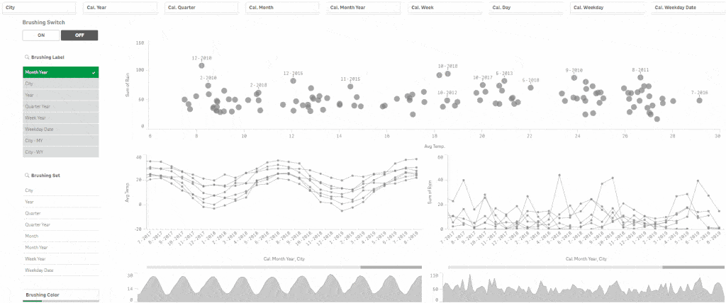
What I want to achieve?
- charts can be switched from default to brushing mode
- brushing Set (which dimensions the charts react to and which don’t) can be adjusted
- user can choose from multiple dimensions for the main chart
- color for highlighting can be changed
So, like this:
How did I do it?
1. Create data islands for picking the chart dimension, brushing set, and color. For dimension and color, you can also use a variable object, because only one value will be selected. For the brushing set, you need a filter pane because combinations must be possible.
2. Create a brushing ON / OFF switch and a respective variable. I have vBrushing, which can have either „ON“ or „OFF“ value.
3. Create a variable that gets a value of one selected dimension for the main chart. I have vBrushingDim, with expression:
=only( [Brushing Dim] )
4. Create a variable, that will hold the brushing set = fields you do not want your charts to react to. I have vBrushingSet, with expression:
='[‚ & replace( GetFieldSelections( [Brushing Set], ‚,‘ ), ‚,‘, ‚]=,[‚ ) & ‚]=‘
5. Create a variable for highlighting color that is conditioned to brushing switch. I have vBrushingColor, with expression:
if( vBrushing = ‚OFF‘, darkgray(180), if( isnull( only( $(vBrushingDim) ) ), lightgray(180), $(c_Qlik$(=only( [Brushing Color] ))) ) )
6. Adjust the measure expressions in the charts where you want to have brushing possible. For example, one of my expressions is:
avg( { $(=if(vBrushing=’ON‘, ‚< $(vBrushingSet) >‘ , ‚$‘)) } [#Temperature] )
7. Change the dimension in the main chart to =$(vBrushingDim)
8. Adjust the color settings to custom by expression, which is $(vBrushingColor)
And that should do it… well at least it worked for me 😀
Happy Qliking!
Read my other blogs HERE.


