


There are many use-cases which require some sort of comparison. You are asked to compare salesmen, departments, countries, technologies or even flower species. Today we will be using the well-known Iris flower data set. On one hand I feel a bit guilty for the lack of creativity in the data set selection, on the other hand the data set is easy to download, easy to understand and it gives one nice-looking density plot. Download the data here. The csv contains 50 samples of 3 different iris species and attributes: sepal length, sepal width, petal length and petal width in cm. Load data into Qlik Sense so that there is 1 table in the data model, no transformations are needed. Name the table IrisData.
Show me the numbers
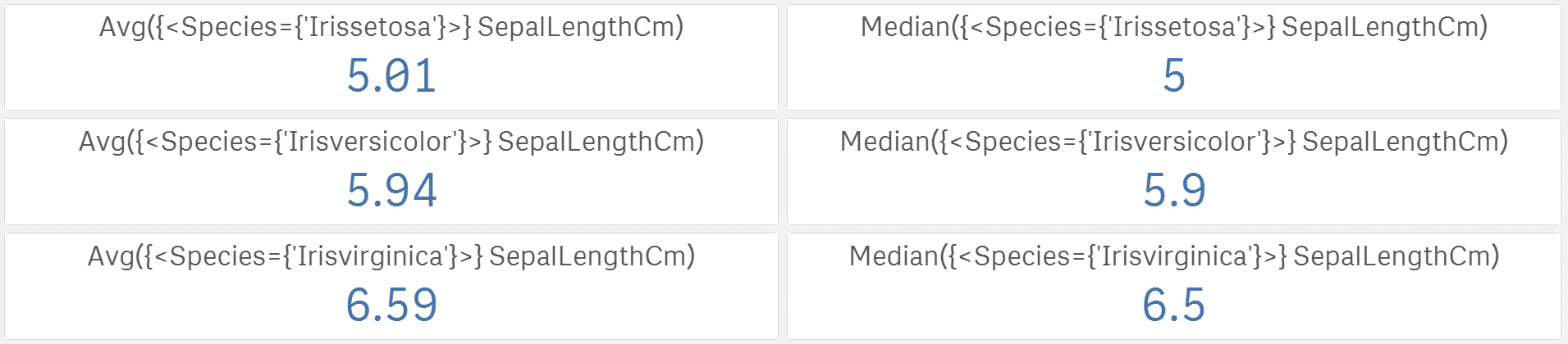
We will compare sepal length of the 3 different species. The first thing that comes to my mind is to calculate average for each iris type. One could argue that median is a better choice and that one would be probably right. If we want to look for the centre of the data, median is usually better choice. Let’s do both:
Now we know that the longest sepals belong to versicolor, but what if the lengths actually differ a lot within a single iris category? The higher the spread is the less significant are the differences in averages. A very well known spread measure is standard deviation:

Now we know that setosa has much smaller spread than virginica. The last information missing is the shape of the data.
Visualise the differences
Are the lengths skewed or symmetrical? Maybe some distribution is more pointy that the others (we could also calculate kurtosis to find out). Histogram could tell us that, but I am not the biggest fan of Qlik Sense’s histogram. Don’t get me wrong. Qlik makes a great BI tool, but it simply is not designed as statistical tool. What I am missing the most are the settings of min/max values on x-axis (not available in version November 2019 and older), which would be very useful to compare the shape, centres, skewness and curtosis. But let’s work with what we have for now:

Histograms
I do not know about you but these histograms brought us just little information compared to the potential of this chart. Yes there are differences in shapes but how big are the differences? Due to the lack of x-axis min/max settings we are missing information about data centres differences and spread differences. For example we already know from standard deviations that setosa has the smallest spread but can you see it here? If you do not look at the x-axis values you could easily assume that the spread of those 3 is the same and that would be far from reality. We will have to dig a bit deeper.
There are 2 nice visualisations in Qlik Sense showing where the data are located and how big is the spread in a single picture – distribution plot on the left and box plot on the right. If you are a box plot master you can see also the shape there a little.

Distribution and box plot
This is not enough for me. There must be a better way to see all nicely in one simple picture. Let’s get help from R and create a density plot in Qlik Sense.
Use R to get the density plot data
We will use R to calculate the density values. If you would like to learn more about density function and how it works look here. There are 2 ways on how to use R and Qlik Sense together. Either keep it separated and load R results in Qlik Sense as any other data source or use the SSE R-plugin to send data, run R script and receive data directly in Qlik Sense with no need to save results externally. The following lines can be used if you have Qlik Sense integrated with R via the plugin. With a little R knowledge the script can be easily modified to run in R outside the Qlik Sense.
IrisDataDensity:
Load * Extension R.ScriptEval(
'# install.packages(tidyverse, repos="http://cran.us.r-project.org"); //keep # if you have this package already installed
# install.packages(magrittr, repos="http://cran.us.r-project.org"); //keep # if you have this package already installed
library(tidyverse);
library(magrittr);

data <- as.data.frame.list(q);

data %<>%
    pivot_wider(names_from = "Species", values_from = "SepalLengthCm") %>%
    apply(2, density, na.rm=TRUE) %>%
    unlist(recursive=FALSE);
result <- as.data.frame(
              data[endsWith(names(data), ".x")|endsWith(names(data), ".y")]);
result %<>%
    mutate(DensID = row_number()) %>%
    select(DensID, everything()) %>%
    select(-c("Id.x", "Id.y")) %>%
    pivot_longer(cols = -"DensID") %>%
    separate(col = name,
        into = c("Iris", "Species", "Coordinate")) %>%
    mutate(Species = paste(Iris, Species, sep = "-")) %>%
    select(-Iris) %>%
    pivot_wider(names_from = "Coordinate", values_from = "value");',
IrisData{Id, SepalLengthCm, Species});
The script adds new table into our data model:

Make the density plot
As a base we will use the standard line chart. Set the following:
- x as Group Dimension
- Species as Line Dimension
- y as Measure
- switch line chart to area chart in presentation section
- in x-axis settings check option Use continuous scale
- set labels and title

Density plot of sepal length by species
Perfect! We have all the answers in a single picture: how the species differ in terms of position, spread and shape of the sepal length data? The longest sepals are typical for virginica and the smallest ones for setosa. Look at the plot widths: spread of virginica is about twice bigger than spread of setosa. Versicolor seems to be slightly skewed and setosa distribution is the pointy one. Run the script for other iris attributes or even better: optimise and upgrade it to calculate density for all measures SepalLengthCM, SepalWidthCm, PetalLengthCm and PetalWidthCm at once.
Check also the last article from the Creative visualisations in Qlik Sense series about animated scatter plot.


